Planet Monochrome
Welcome (back to) Pleasantville, where zapping vibrant and natural colors from design choices creates a duller world of passive and complacent drones.
There are some places where the road doesn’t keep going in a circle. There are some places where the road keeps going.
— Bud Parker
Welcome Back To Pleasantville
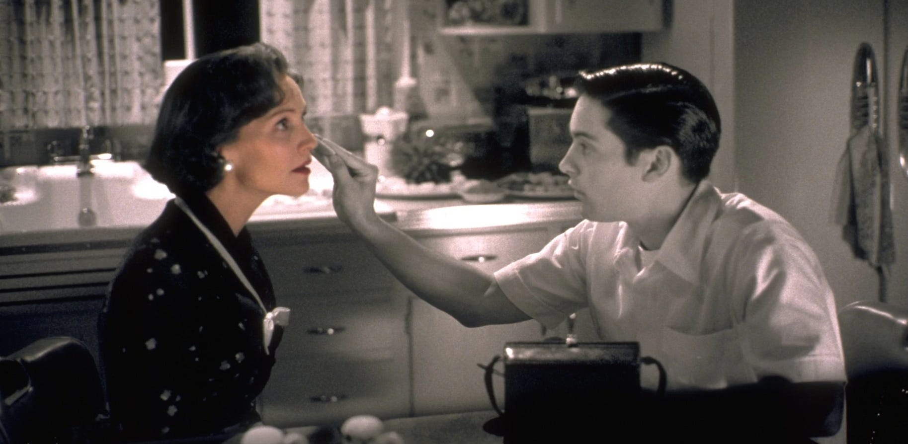
The 1998 film Pleasantville explores the transformative power of expressing and embracing personal change and the clash between conformity and individuality. The story revolves around two modern teenage siblings David and Jennifer, who are transported into a 1950s black-and-white television show, Pleasantville.
Pleasantville is a place of idealized perfection, where everyone adheres to rigid social norms, and human emotions that might create conflict are suppressed. As the siblings introduce new ideas and behaviors, the town transforms, cinematically symbolized by the gradual emergence of colorized characters and locations.
The play of black and white against color in the cinematography is a metaphor for “progress” and transformation. Black and white represents Pleasantville's residents' restrictive, monotonous existence, bound by societal expectations and a repressive closure to the outside world. Characters that inhabit this closed world must always perform as “perfect” and impress upon others eagerness, sincerity, cleanliness, and their best idealistic selves so as not to disrupt the monotonous flow of social cohesion. The introduction of color is supposed to symbolize awakening, freedom, and the richness of expanded human experience, including flaws. As characters experience love, curiosity, and self-expression, they "come to life" in color.
The premise was clever at the time, and the film is still amusing, but given the reputation Hollywood has forged for itself as a cesspit of demonic pedophiles grooming young minds for the globohomo agenda, the film in retrospect appears to embrace the message concurrent with decades of social engineering and mind programming: true fulfillment and progress come from embracing change, diversity, tolerance, and acceptance, including “flawed” people who require self-actualization through public displays of expression which they must impulsively accept in their desire to become their “true selves” at the altar of that new religion of hyper-individualism.
Fast forward more than half a century from the staid conformist 1950s of the nuclear family Rockwellesque Americana which the film critiques and we have purple-haired, body-pierced, inked-to-the-nines emotionally incontinent, under-parented, over-supervised, over-vaccinated, spiritually vacuous narcissistic weirdos doing TikTok self-confessionals alone in their cars about how they can’t find that elusive true love that Hollywood promised them growing up, despite working so hard on themselves, by defiling their natural God-given beauty while drugging themselves at Big Pharmakeia’s medicine cabinet so they end up balling their eyes out for millions of strangers to watch on social media, which only conveys weakness through confusion, celebratory mental illness, victimhood as social capital, and a total lack of self-awareness through their entire embodied being, which results in millions of drifting spiritless vessels more confounded and incomprehensible to themselves than this paragraph probably has been to you.
Have we evolved culturally and spiritlessly in a reaction against conformity that only created a new brand of conformists who are so adrift in debauchery and defilement, nihilism and cynicism, that they make those cardboard black and white characters of Pleasantville with clean skin, pretty smiles, and earnest sincerity appear like the new reactionaries?
What happens when the reaction to social conformity, becomes the very thing it believed it was reacting against with extreme methods and techniques that leave nothing off limits?
For one, you get a lot of highly undesirable social changes, including hyper-fragile emotionally incontinent weirdos filming their most private and personal affairs in their cars to strangers, plus the first essay of one-hundred-and-forty-six essays published on this Substack which recently saw a resurgence of readers:
What about the other aspects of Pleasantville, namely the play of desaturated cinematography to represent social conformity and color to illustrate the individual escape to a vastly “more liberating” world?
In the fictional Pleasantville show, the road out of town doesn’t go anywhere. It simply circles back to Pleasantville.
Is the socio-cultural pendulum swinging in opposite directions over generations simply a sign of humanity going in circles, regressing from one extreme back to another?
Have we reached a new peak of social conformity that began in the 1960s as a rebellion against “conformity” which manifests increasingly as regressive self-expressive hyper-individualism prone to mental illness, acts of bodily and aesthetic destruction that have epitomized a collective subconscious desire to return to Pleasantville via that desaturated monochrome world?
Strangely, it appears so.
Frequency Perception
White, black, and grays have unique and interesting properties on the color spectrum. White light is a combination of all the colors of the visible spectrum. When light contains all the wavelengths of visible light in roughly equal proportions, it appears white to the human eye. This means that white light does not correspond to a single frequency, but rather to a mixture of many frequencies.
Black, on the other hand, is the absence of visible light. When an object appears black, it means that it is absorbing all wavelengths of visible light and not reflecting any back to the observer. Black does not correspond to any specific frequency on the color spectrum. It is essentially the lack of any visible light reaching the eyes.
In attempting to understand this process better, it all comes down to how our eyes and brain perceive color. The human eye has photoreceptor cells called cones that are sensitive to different wavelengths of light, corresponding to different colors. There are three types of cones, each sensitive to different ranges of wavelengths: one type is most sensitive to short wavelengths (blue), another to medium wavelengths (green), and the third to long wavelengths (red).
When light enters the eye, it stimulates these cones to varying degrees based on its wavelength composition. The brain then interprets the signals from these cones to produce the perception of color. For white light, all three types of cones are stimulated equally. For black, none of the cones are stimulated because there is no light to trigger a response. Gray on the other hand is a perceptual outcome resulting from equal reflection or mixing of all wavelengths of light at reduced intensities. It is not associated with a particular frequency but rather with a balanced mix of all frequencies at varying levels of brightness.
Who’s down with PLB?
Hell no! Not me!
— Naughty By Nurture
Pleasantville Lesbian Basketball
The WNBA is the women’s equivalent of the men’s professional basketball league— the NBA, except without the excitement, thrills, skills, and well, everything that matters. It’s subsidized by the men’s league and their fans and still manages to lose tens of millions of dollars each year because women hate watching other women succeed. And the women of the WNBA refuse to succeed by lowering the rim so they can dunk, bringing the three-point line closer, and staying out of the Waffle House so they can keep fit and run faster and jump higher, and not put the fans to sleep each night.
But they keep the WNBA around because neo-feminists would make uncomfortable noises if they ever shut it down. They can say they're doing something “to inspire young girls” to want what every neo-feminist fantasizes about every minute of their pathetic lives—to be equal or better than men at everything especially physical games that they never biologically or psychologically evolved to be successful at.
A third of the players in the WNBA are also lesbians, and lesbians aren’t fond of wood. So the league proceeded to remove all signs of wood on the court and replace them with a sheath of bizarre monochrome that appears like watching scenes from Pleasantville on programming screens.
It’s not just lesbian basketball. The men’s game has turned to monochrome courts to pacify the crowd because when you have home-court advantage you don’t want vibrant colors to stimulate rowdy fans into cheering loudly, since monochrome colors are well-known to have certain anesthetizing psycho-social effects on the human psyche. More on all that in a minute.
Professional basketball is just the latest popular culture enterprise to embrace a burgeoning design fad that appears to have begun a decade ago in a place where all terrible ideas begin—with wealthy and vapid celebrities.
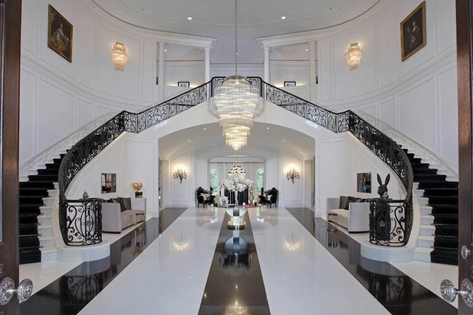
In 2011 British heiress Petra Ecclestone purchased (with her father’s money) the famous Spelling Manor in Beverly Hills for a then-record $85 million. With a full gutted redesign, she matched the new interior to her lifeless personality and erased any natural or vibrant colors. She then sold the property to an Arab Sheik for $120 million. The Sheik now has the 55,000 square-foot mansion (5100m3) back on the market for $137 million after a $40 million price reduction.
You get the picture.
The worst part about celebrity trends is that they reveal that celebrities even exist. The second worst part about their trends is that they eventually seep into the masses whose devoted adoration and attention ensures their continued celebrity existence and prosperity.
Popular designer magazines like Home & Garden and Architectural Digest tend to ape celebrity choices and serve as a feeder mechanism to the masses. With around-the-clock home improvement networks like HGTV following the latest trends to trickle down. In the case of the monochrome colorless palette, it appears to have trickled down, well, everywhere.
Are consumers consciously choosing this colorless palette to create Pleasantville or is it part of the nefarious agenda to pacify the masses using the science of the color spectrum and the neuro-psychological effects of a desaturated world?
Once again, our train arrives at “conspiracy station” where the choices are:
an organic trend being naturally “influenced”
or, planned and socially engineered
Pleasantville Homes
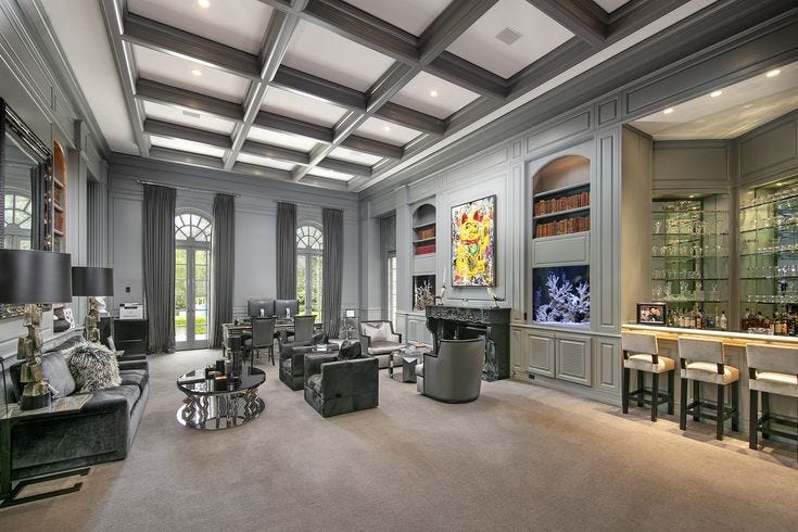
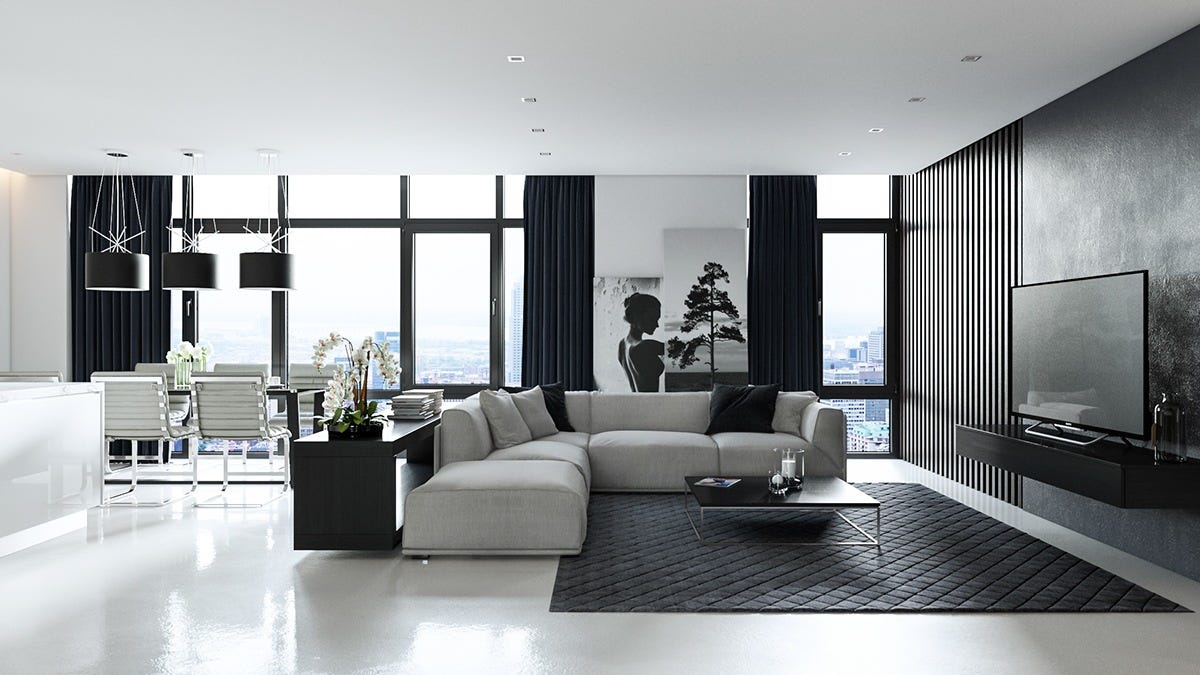
Around the end of the last decade home builders and interior designers got the celebrity memo and went all-in on monochrome.
Monochrome kitchens became all the rage.
Monochrome living rooms became all the rage.
Monochrome bedrooms, gyms, closets, pantries, garages, all the way down to fixtures and accessories including cats and dogs.
Everything became monochrome and if somebody’s home wasn’t monochrome, it was “outdated” and needed some designer “updating.”
Every design choice made by celebrity HGTV hosts in their quest to influence the sloppy and unrefined masses to “update” their homes, revolved around monochrome.
To show any natural or vibrant colors or even expose any wood material became a design crime.
Pleasantville Cars
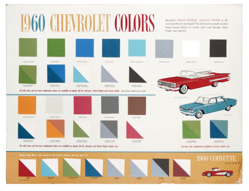
When the first mass-produced automobiles came off the Ford Motors assembly lines, Henry Ford famously said, “Any customer can have a car painted any color so long as it’s black.”
By the 1950s vibrant colors were introduced to all brands of automobiles, including soft pastels of green, yellow, and pink. The most popular selling cars were not associated with the monochrome palette.
These trends more or less continued through the 1990s.
Fast forward to today.
The past year of color choices in car sales were all on the monochrome spectrum, including white, gray, black, and silver, accounting for 76% of total sales in the United States. With shades of blue-gray, and dark blue that can often appear black, the total monochrome figure pushes toward 90% of all car sales.
Electronics manufacturers only sell devices in monochrome colors. If a consumer wants to add color to their tablet, computer, or phone device, they might have some choices with after-market protectors, stickers, or cases.
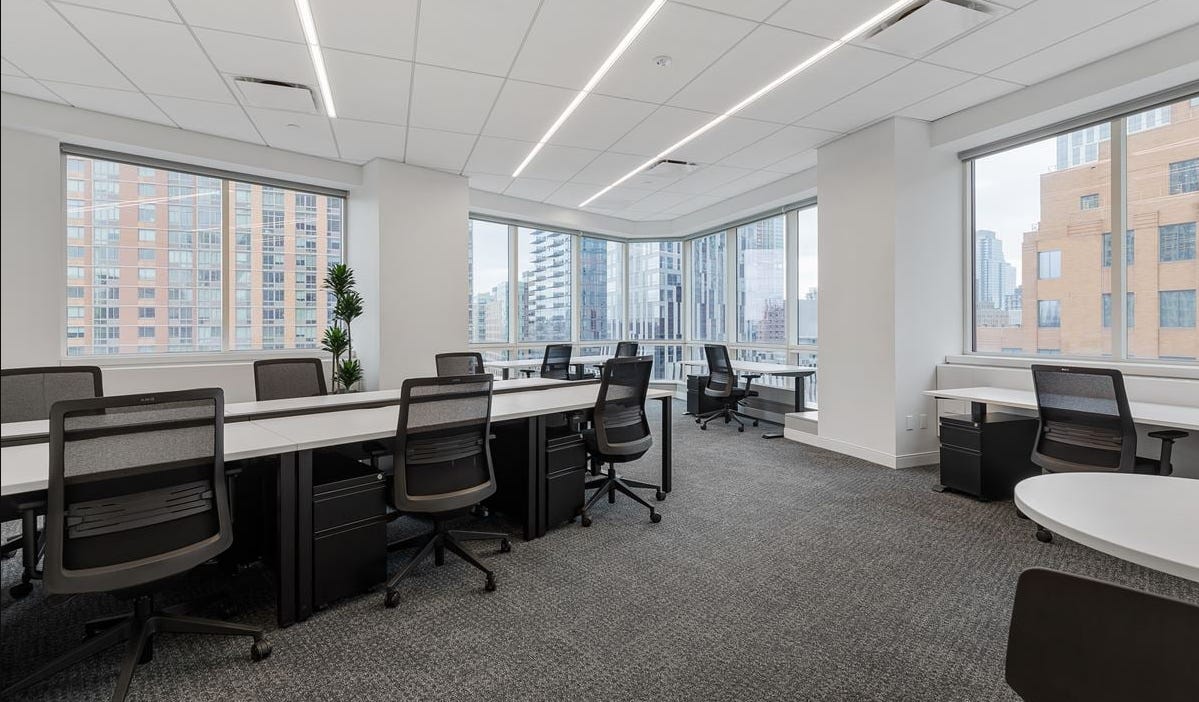
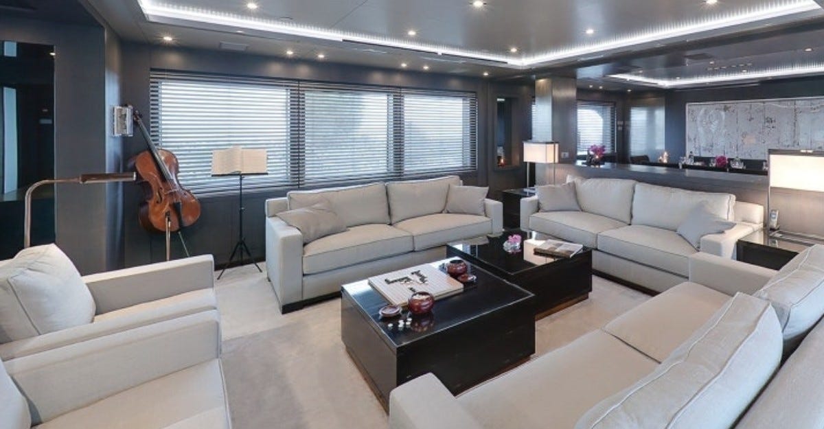
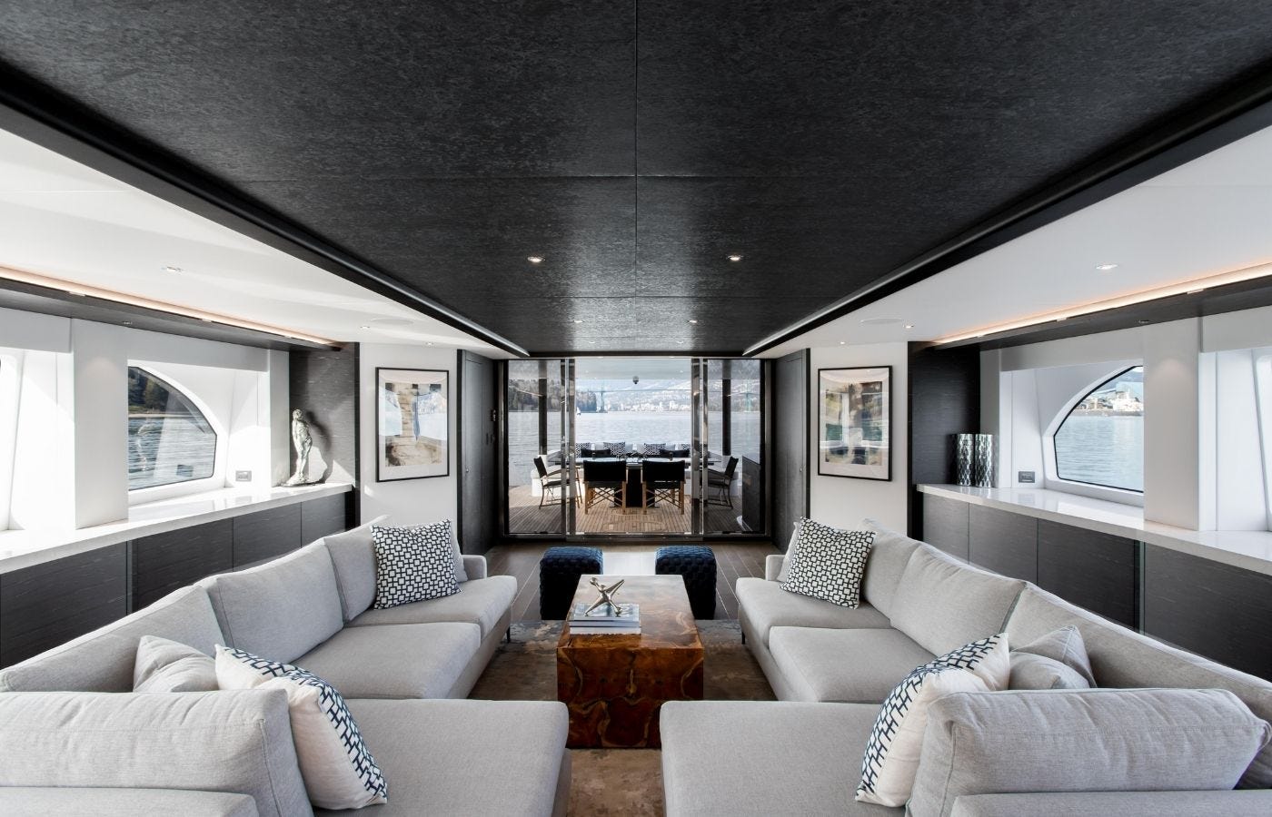
Office spaces, co-working spaces, public gyms, private jets, private yachts, modern airports, almost everything in our world is turning monochrome.
Billionaire toys—yachts and jets…
The new Laguardia.
The new Salt Lake City Airport, design phase and after.
Denver.
You get the picture, again.
Back to that original question: What are the neuropsychological, and physiological effects of living in Planet Monochrome?
Brave New Monochrome
Design choices, particularly those involving color, are tools that can shape our emotional and cognitive states.
The emotional impact of these monochrome colors cannot be overstated. Black is often associated with power, elegance, and sophistication. Yet, it also carries connotations of death and evil. Its use in design can instill a sense of authority and oppression, leading to subdued behavior. Black can evoke strong negative emotions, contributing to a sense of control and passivity.1 This color’s ability to dominate and impose creates environments where individuals feel less inclined to challenge the status quo. A black-dominated environment might subtly impose a sense of fear or respect, ensuring compliance and reducing rebellion.
Conversely, white symbolizes purity and cleanliness but can feel cold and sterile when overused, promoting emotional detachment and passivity. In "Color Psychology and Color Therapy," Faber Birren explains how white can create feelings of isolation and detachment.2 White’s clinical and uninviting nature can reduce emotional warmth and social interaction, leaving individuals feeling disconnected and disempowered. In a society where emotional connection is paramount for collective action and resistance, the pervasive use of white can effectively dampen communal ties and affinity.
Gray, often perceived as neutral and balanced, can also evoke feelings of boredom and depression. The findings of Valdez and Mehrabian underscore gray’s potential to create a subdued environment, further reducing stimulation and engagement. This color's association with neutrality can foster a sense of indecisiveness, contributing to a weak and indecisive society. As individuals become less emotionally and cognitively stimulated, their ability to resist control diminishes. The dreariness of gray can permeate daily life, making it difficult for individuals to find motivation or passion.
Neurologically, the brain processes the black-and-white spectrum differently from colors. The visual cortex engages less with monochrome, reducing cognitive load and engagement. Research on the sensory and cognitive contributions of color to the recognition of natural scenes indicates that color images require more neural resources, leading to higher levels of cognitive engagement.3
Spillmann and Werner’s work on long-range interaction in visual perception supports the argument that monochrome stimuli provide less sensory input, contributing to a state of reduced engagement and arousal.4 Enns and Rensink’s findings on sensitivity to three-dimensional orientation in visual search illustrate how color enhances cognitive processing and engagement.5
Colors affect physiological responses such as heart rate and blood pressure. Monochrome environments, by their nature, tend to lower arousal, promoting a relaxed, less engaged state.
Monochrome design can also impact circadian rhythms and sleep patterns. Colors play a crucial role in regulating these natural cycles. Dark, monochrome environments can disrupt circadian rhythms, and neutralize our biological clocks. The lack of vibrant colors, which are essential cues for maintaining healthy circadian rhythms, can lead to sleep disturbances and overall fatigue, further enhancing passivity.6
Research on the effects of the color of light on nonvisual psychological processes supports the claim that color influences mood and mental health. Bright and colorful environments are often used in therapeutic settings to improve mood and mental health.7
One study in Japan on color preferences with human subjects illustrates how vibrant colors can enhance psychological well-being, contrasting sharply with the dulling effect of monochrome, with subjects confessing they preferred the color white for its “calming effects.”8
Whether our monochrome planet is being socially engineered or is just a bi-product of current trends that trickle down from vacuous and tasteless celeb…what a minute, it just occurred to me that this Substack background is an oppressive dark gray color with white text overlayed.
Am I socially engineering good citizens to be passive and complacent readers?
On a second and third glance, it appears the opposite could be true of Planet Monochrome and the original opening thesis of coming full circle with socio-cultural reactionary forces is most accurate in a desire to return to Pleasantville.
An arguement could be made the trending desire for monochrome surroundings is a healthy and natural reaction to the pervasive symbols of the globohomo agenda.
After all, it’s almost June again, and it won’t be long before we’re all begging for a return to Pleasantville.
Somebody, please bring back Pleasantville!!
For the love of God, somebody please!!!
Orange buttons!
Fixed Income Pensioner Discount (honor system)
Student Discount (valid .edu email)
Thank you for sharing
The Good Citizen is now on Ko-Fi. Support more works like this with one-time or monthly donations.
Visit shop.thegoodcitizen.live
Donate
BTC: bc1qchkg507t0qtg27fuccgmrfnau9s3nk4kvgkwk0
LTC: LgQVM7su3dXPCpHLMsARzvVXmky1PMeDwY
XLM: GDC347O6EWCMP7N5ISSXYEL54Z7PNQZYNBQ7RVMJMFMAVT6HUNSVIP64
DASH: XtxYWFuUKPbz6eQbpQNP8As6Uxm968R9nu
XMR: 42ESfh5mdZ5f5vryjRjRzkEYWVnY7uGaaD
Valdez, P., & Mehrabian, A. (1994). "Effects of Color on Emotions." Journal of Experimental Psychology: General, 123(4), 394-409.
Birren, F. (1969). "The Influence of Color on Psychological and Physiological Response." Journal of Applied Psychology, 53(5), 389-394.
Gegenfurtner, K. R., & Rieger, J. (2000). "Sensory and Cognitive Contributions of Color to the Recognition of Natural Scenes." Current Biology, 10(13), 805-808.
Spillmann, L., & Werner, J. S. (1996). "Long-Range Interaction in Visual Perception." Trends in Neurosciences, 19(10), 428-434.
Enns, J. T., & Rensink, R. A. (1990). "Sensitivity to Three-Dimensional Orientation in Visual Search." Psychological Science, 1(5), 323-326.
Brainard, G. C., & Hanifin, J. P. (2005). "Photons, Clocks, and Consciousness." Journal of Biological Rhythms, 20(4), 314-325.
Knez, I. (2001). "Effects of Color of Light on Nonvisual Psychological Processes." Journal of Environmental Psychology, 21(2), 201-208.
Saito, M. (1996). "Comparative Studies on Color Preference in Japan and Other Asian Regions, with Special Emphasis on the Preference for White."















"A third of the players in the WNBA are also lesbians, and lesbians aren’t fond of wood." 🤣🤣🤣🤣🤣🤣🤣🤣🤣🤣🤣🤣🤣🤣🤣🤣🤣🤣🤣🤣🤣🤣🤣🤣🤣🤣🤣🤣🤣🤣🤣🤣🤣🤣🤣🤣🤣🤣🤣🤣🤣🤣
I've recently started attending an Orthodox church. One of the things that struck me from my first visit is that there is *no* empty space on the walls. Every square inch is filled with beautifully colored icons. There's definitely a profound psychological effect.